Graphic Design
This is my graphic design work page. This is where I keep all the work that I have done during my employment. Unlike my freelance work, this line of work is more about jobs I have done for corporations. This is the area that made me realize I would like to pursue a career that revolves around more marketing and branding. While I still hold my true desires, I really do appreciate the design world and the challenges that push me to go farther.
Logo Design


During the summer of the pandemic, I started a freelance career in creating custom logos mostly for content creators on the platforms YouTube & Twitch. It was a decent start in business for me during the pandemic, and I enjoyed it very much.
Perk-a-Cola Logos

These are logos that I created based on the videogame Call of Duty® Zombies. In the game there are upgrades you can buy that are themed as soda bottles.
Helmet Icons

Helmets and masks are one of my favorite things. They are just so many designs and decorations of them that intrigue me. So, I decided to create icons of various military helmets to express the different eras of soldiers.
Posters
When I was in college, I asked the question, “What would I want to do with my talents after school?” It’s a very hard thing to ask yourself, but it’s important because it sets the core trajectory of how you live your life. One thing that always fascinated me was advertising, more specifically album covers, cereal boxes, movie posters, video game box art, logos, etc. I have always been fascinated by this type of design work because first impressions mean everything, and I always hope to make a good one. With that in mind, I decided to get into poster and covers design myself.
Medical
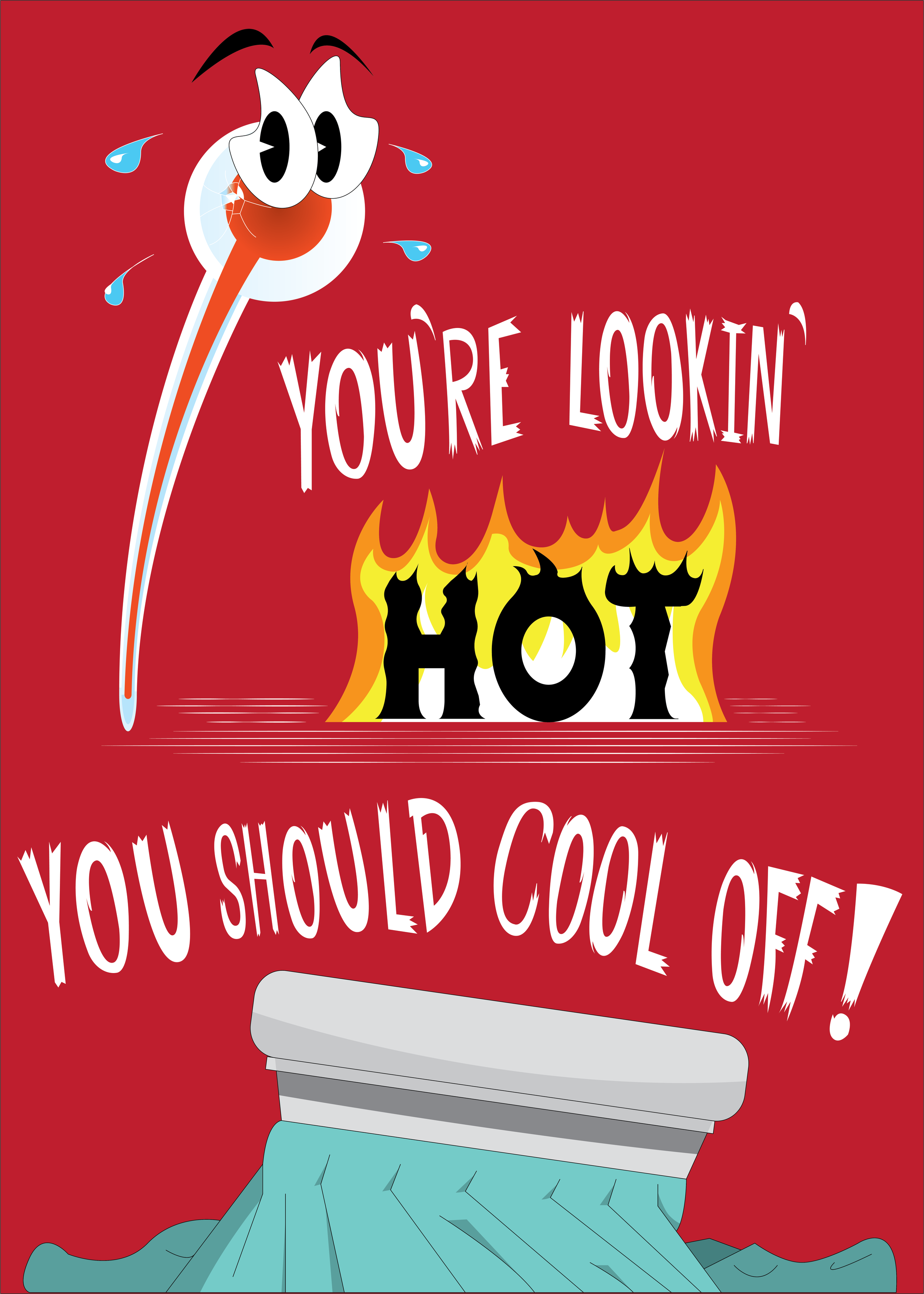
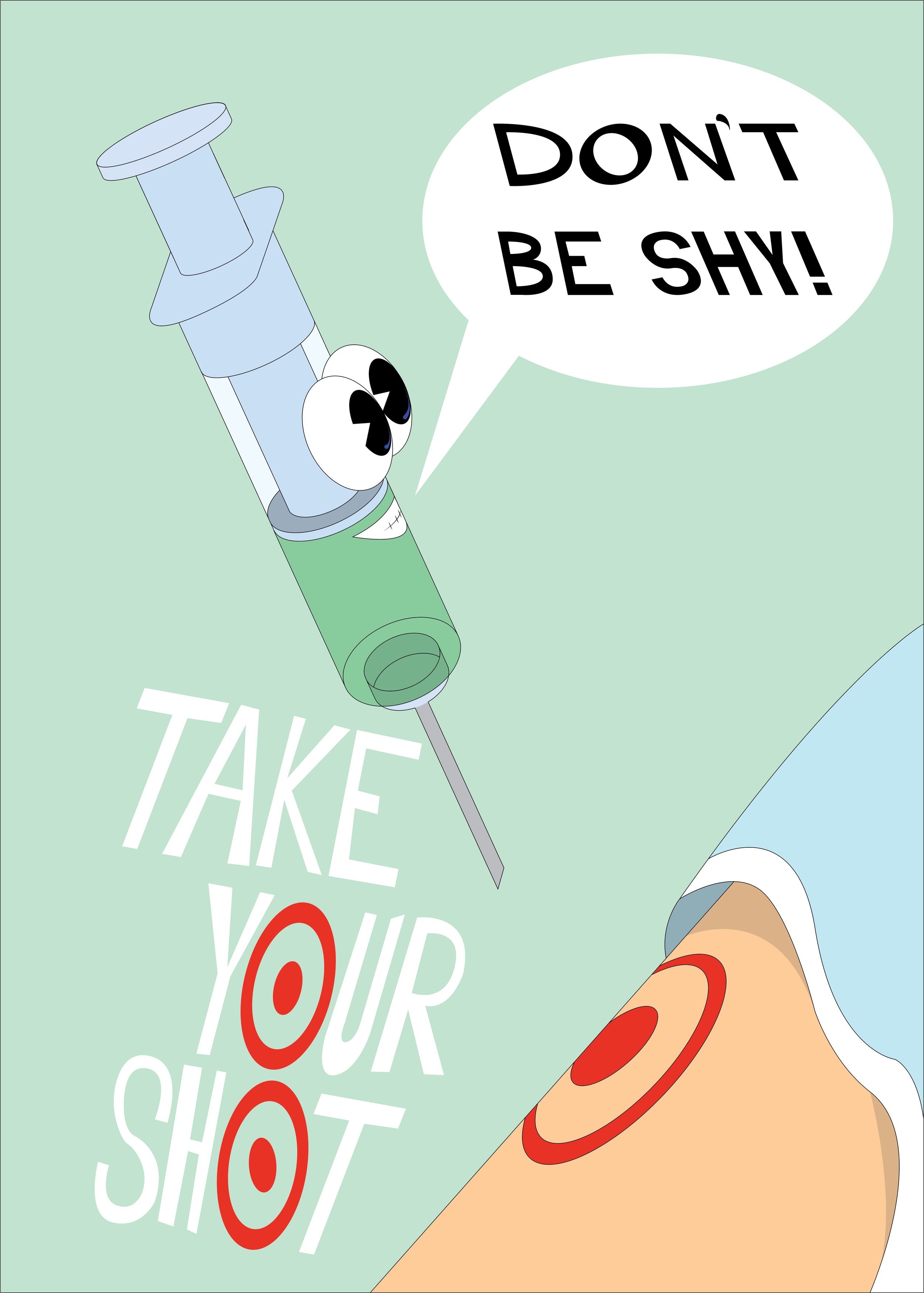
When starting my journey of designing posters, I aimed to appeal to a very youthful demographic. I remember all the fun posters hung up in preschools & children’s doctors’ offices, filled with such fun and creative methods to convey educational values. My personal style uses mostly fun anthropomorphic figures to convey the theme as well as the message. In this instance, the poster on the left is a thermometer reading a temperature so hot he’s about to explode. The one on the right is an injector aiming for a bullseye at the target painted on the arm. The concept of that one was taken from an older poster I created promoting the vaccine for COVID-19, but to appeal to the youth, I went for a more generic and playful look.
Health
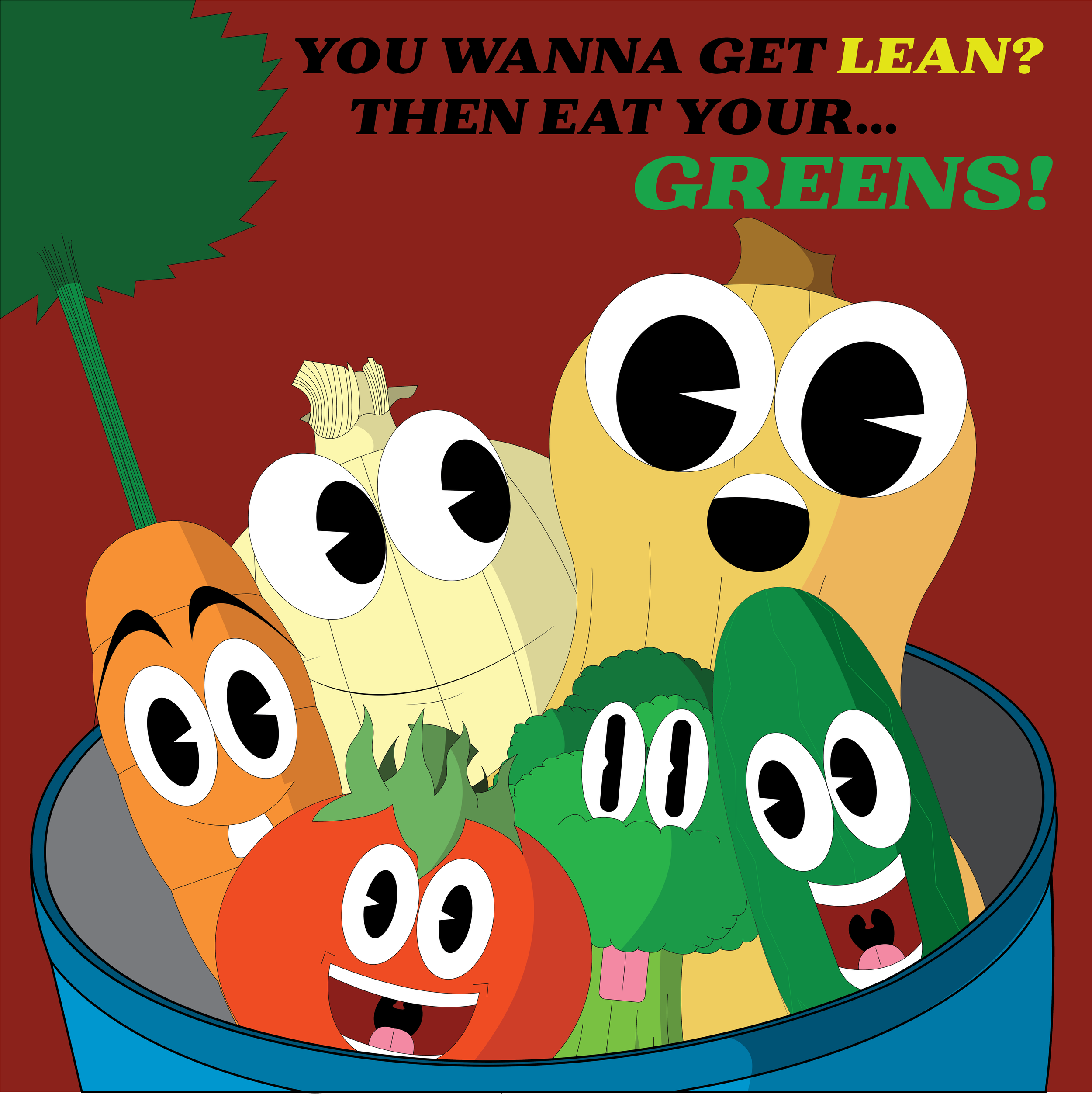
This next poster was playing on that age-old lesson of eating healthy. I created a square-shaped poster with a couple of vegetables looking all cheery, chilling in a pot together. I always imagined this would be hung up within a preschool or elementary school. I think that despite how simple this concept was is really elevated by the subtle nuances from the slight details for each veggie.
Environmental
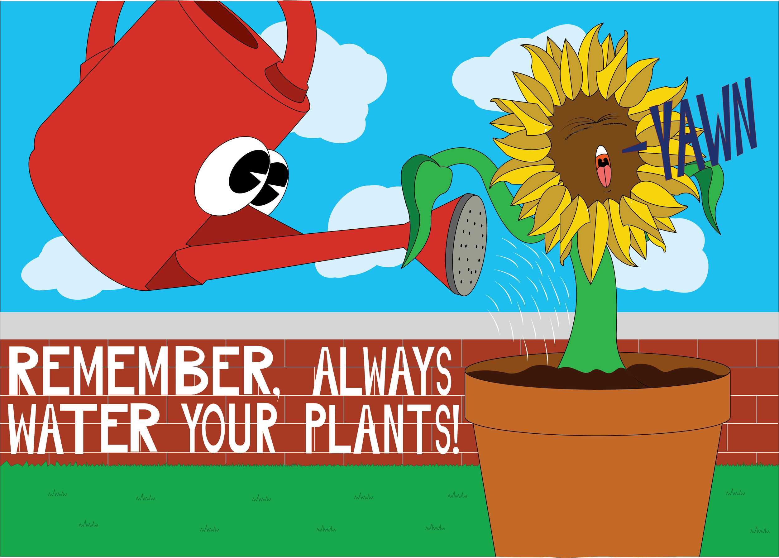
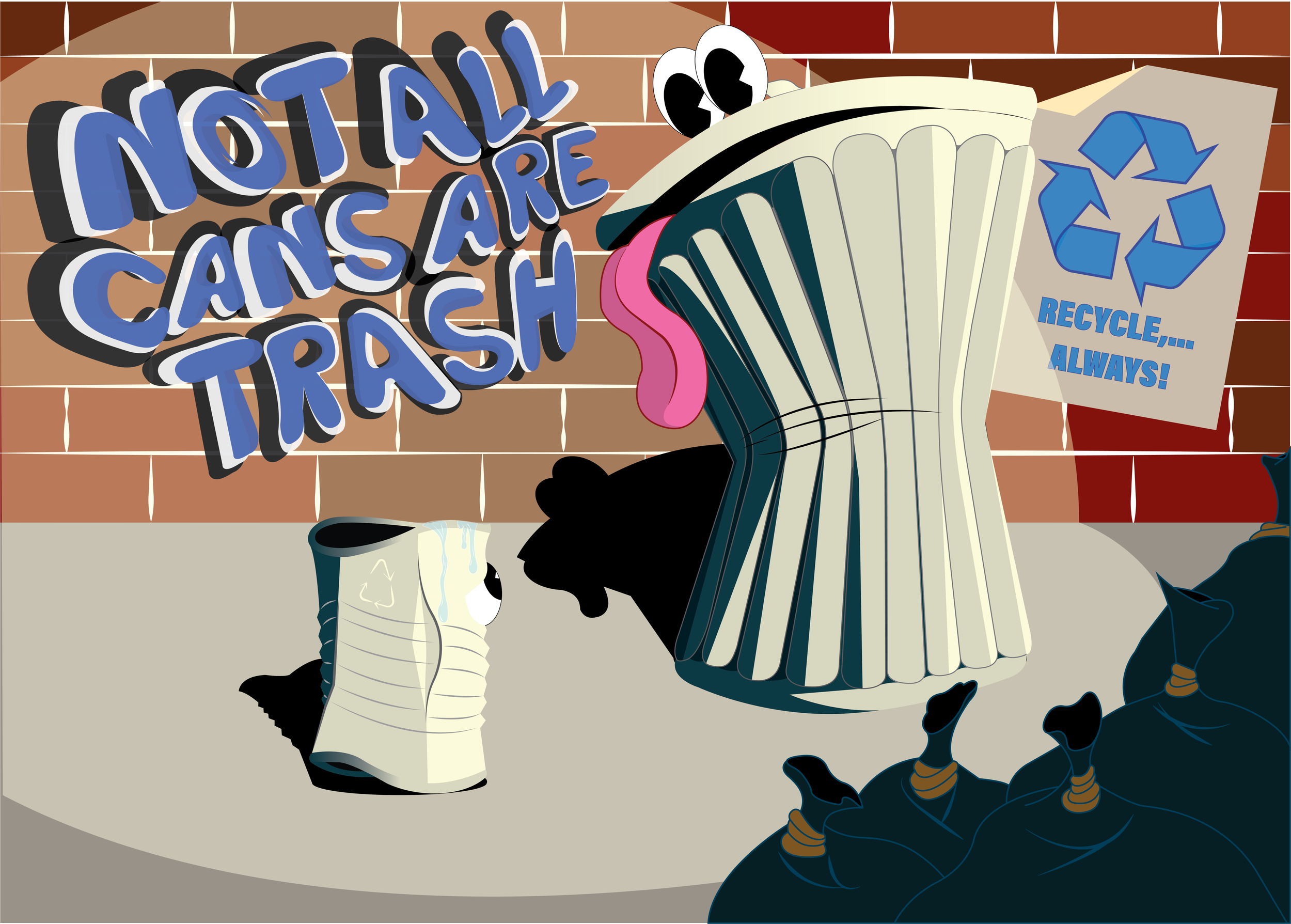
One thing that I always found important in the world is protecting the environment. No matter how big or small, every choice to help makes this world a safer and cleaner place to live. The posters you see above are dedicated to lessons on improving the environment. The one on the left shows a watering can splashing water onto a sunflower, waking it. One thing I remember doing a lot with my grandfather was gardening when he was around, so this piece was dedicated to him and those memories I shared with him. The other poster is themed around recycling, where I created a piece depicting a small can scared that it is about to be eaten by a big trash can. This is probably my most dynamic poster from the educational ones I made. I think it conveys the message in a very complex, mature manner while showcasing a vastness in depth and volume compared to most of my posters.
Dishwashing
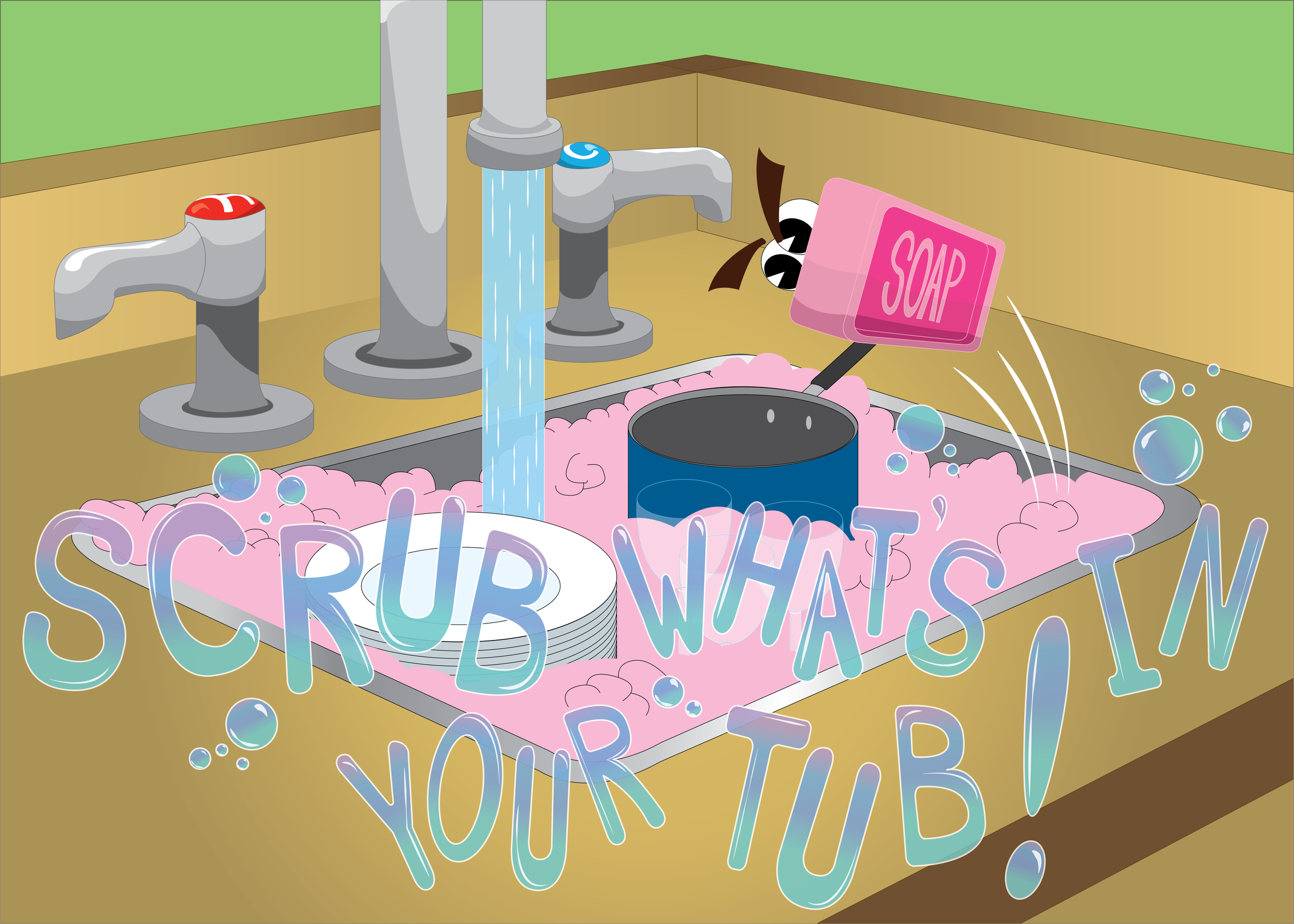
This last educational poster I made is based on a very niche lesson. Now, when I was a toddler in preschool, I remember we had this washing station that we would use to clean our plates after having a snack. This poster was dedicated to that old lesson I learned about cleaning your plates after eating. To illustrate this for the youth, I created a piece of a bar of soap gliding out of the sink tub like a skateboard in a halfpipe. I also wrote the phrase “scrub what’s in your tub” completely out of bubbles. Almost all of the posters I have made have used fonts that I personally created myself, but I am personally very proud of this one since I think it came out the cleanest, no pun intended.
Postcards
As I pursued my development in posters, I began to branch out into other related media. One of these paths was greeting cards, which almost felt a little too fitting, to say the least. For a lot of my posters, I really felt they already fit the greeting card design. For example, my medical posters, as I felt they definitely could work on the front of a sympathy card. This also allowed me to stray away from the playful anthropomorphic style I used for a majority of my posters and allowed me to branch out into my other strengths, like typography.
Stay Warm & Cozy
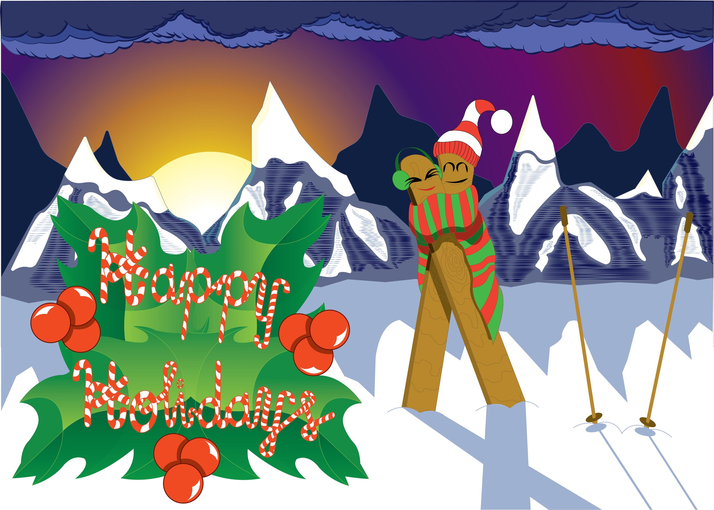
Stay Warm & Cozy is the first-ever holiday postcard I made. After doing several of my posters, I really tried to push myself to experiment in areas I had never really tried enough. So, apart from the pair of skies wrapped together in a scarf, I went and created a snow mountain background being lit up by the sunset. As for my font, that’s where I got the most ambitious. I wrote the phrase “Happy Holidays” in cursive using candy canes in a collage pattern. To make sure it doesn’t get lost in the snow background, I had the font surrounded by mistletoe to give the phrase more visible clarity.
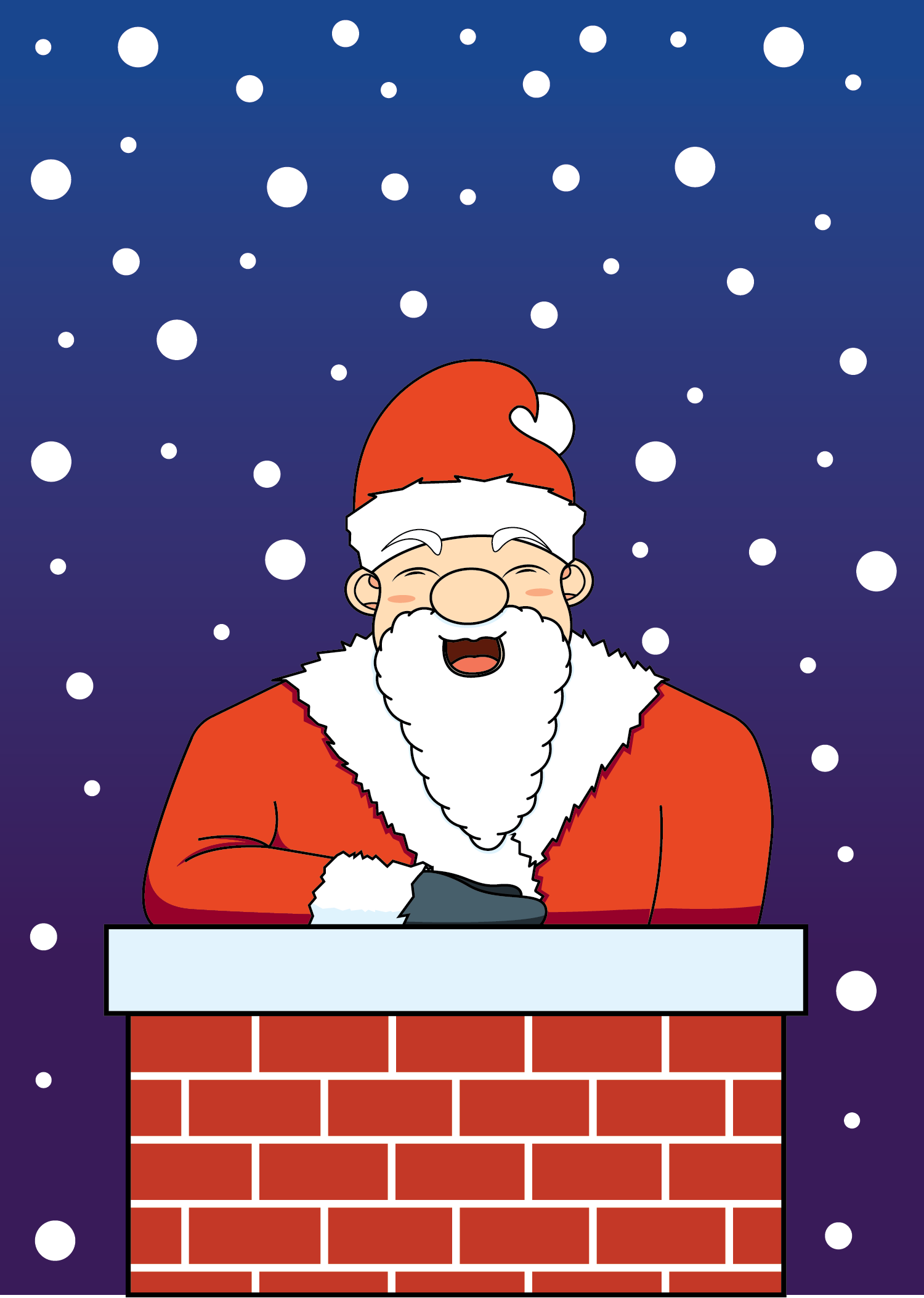
Santa Claus
When the next holiday came, I had done a lot of thinking about my design philosophy for this one. I felt that, though my first one was very strong, I did bite off a little more than I could chew. So, with my next holiday postcard, I decided to take the simpler approach and decided to focus less on details and more on linework. So, for my next one, I simply made Santa Claus rising out of a chimney, as he does. It may not be as complex, but it is very neatly put together.

Surf’s Up in Florida
Eventually, I moved away from holiday cards and expanded my horizons. I decided to attempt a standardized postcard. I first had to pick a place to base it on, so I chose Florida because I love travelling there frequently to go on vacation. I then asked myself, “What makes Florida, Florida?” My mind answered: beaches, and when there are beaches, there is surfing. I created a surfboard with a killer wave logo over it, with the phrase “SURF’S UP!!!” an idea that I came up with for a surf shop back in college. As for the background, I decided to lay this emblem over some rich ocean saltwater to really complement those vibrant blues with some sea greens.
Cover Designs
Going back to the various branching paths I went on after creating my posters, another one that I went on was cover designs. Within this area of my design work, I developed various covers for different types of media.
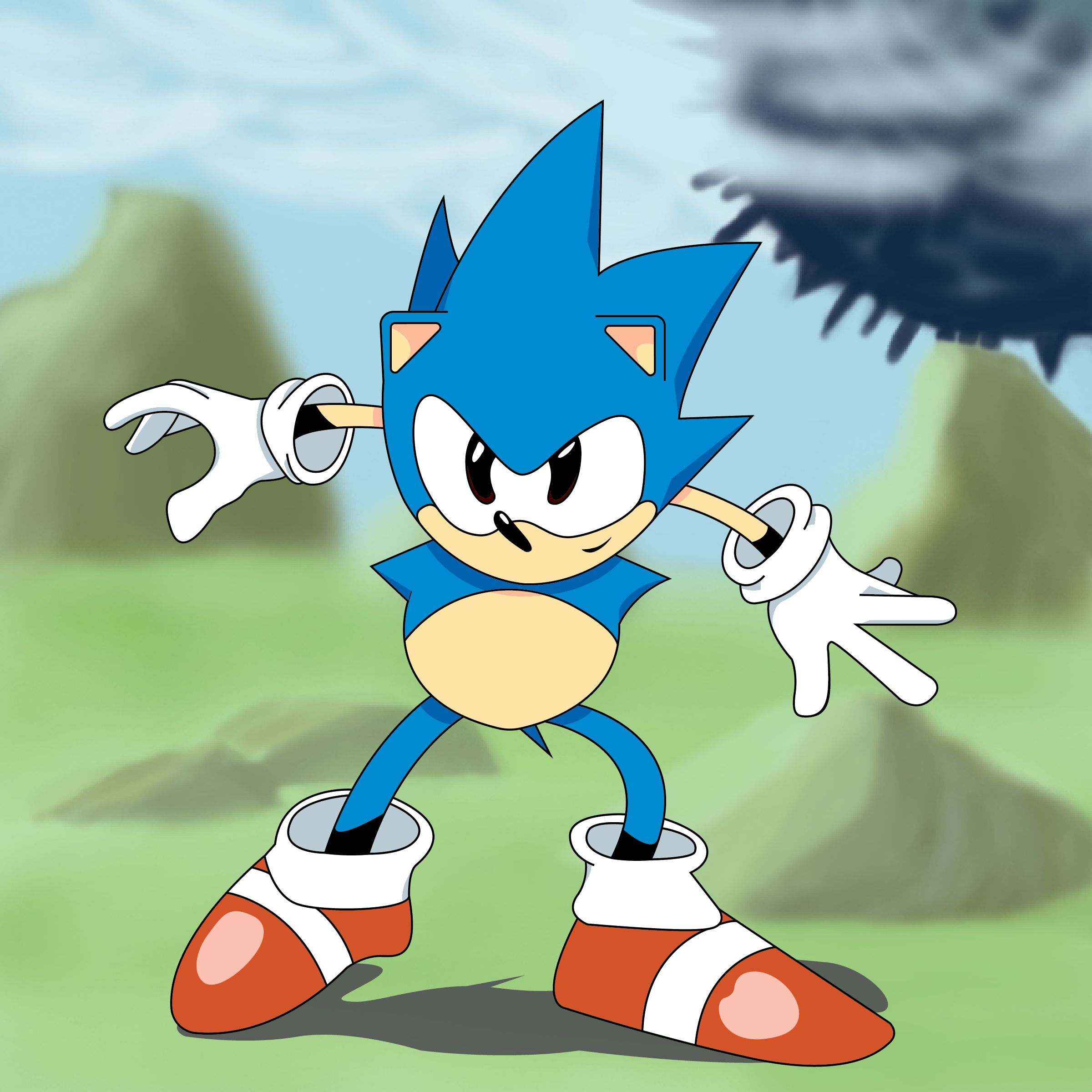
Sonic CD Cover
Sonic was a big part of my childhood, as it was the first video game I ever played. So, I decided to make a cover based on a still frame of a cutscene from the video game Sonic® CD in my own style. I also made the cover into a standard CD cover scale since I thought it was fitting.
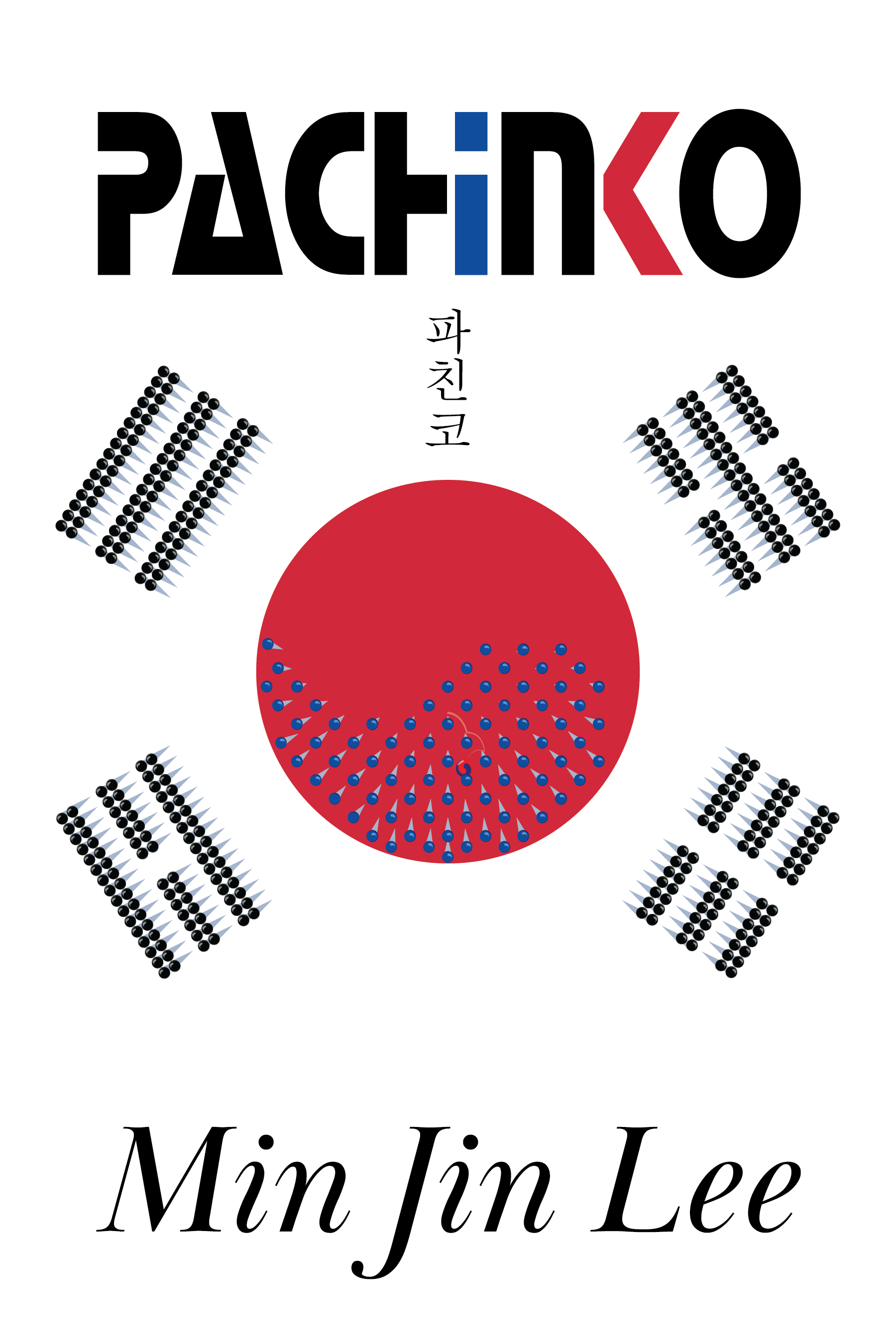
Pachinko
This was a book cover I made for the story Pachinko by Min Jin Lee. It is a story about a Korean family spanning 4 generations that immigrates to Japan during the 20th century while Korea is under Japan’s imperialist control, struggling to start a new life in a country that is very derogatory toward them. I decided to theme the book cover around pride. So, since the book was called Pachinko, I made a Pachinko machine. However, I themed it around the flags of Japan and Korea. Since Japan is the main character’s new home, I made that the backboard, and as for the pins, I patterned and colored them specifically to reference the Korean flag, emphasizing the idea of Koreans immigrating to Japan. I even added a little marble designed like the original Taegeuk circle trickling down the machine to symbolize when their journey began.
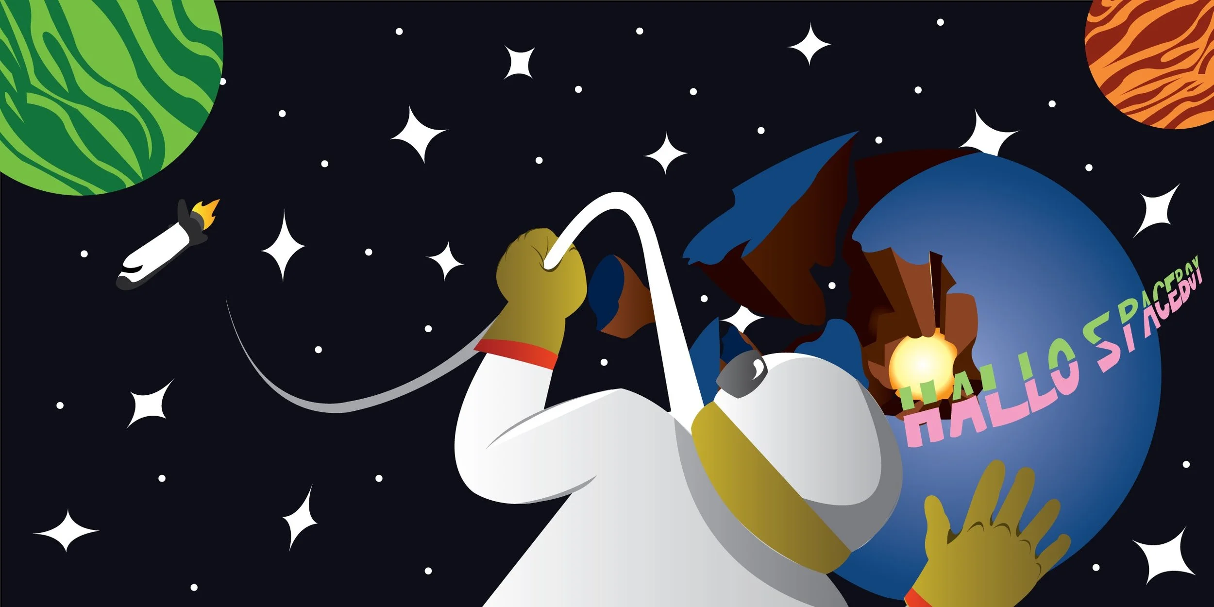
Hallo Spaceboy
This was an album cover that I made based on the song “Hallo Spaceboy“ by David Bowie. I was not a very big David Bowie fan, as I had never heard any of his songs. This was the first song I ever listened to from him, and it really stuck with me. The irony of the song really got my attention, as the lyrics paint the astronaut saying goodbye.

Separate Ways (Worlds Apart)
Another album cover I made dedicated to the song “Separate Ways“ by the band Journey. When designing this, I felt like I wanted to emphasize the secondary title of this song, Separate Ways. So, I created 2 different planets spread far apart from each other. The major attraction behind this album cover is the alt variant showing the opposite perspective from the farther planet’s view.
Crate & Barrel contacted us because we were in their area and asked if we could design and produce safety banners they wanted for their warehouse. This project always stood out to me during my time at the sign shop because it was one of the few projects where I did most of the designing for the banners. I was mostly part of the production side of our team, but one of the designers and my boss allowed me to take a swing at it
When I got out of college, I worked for a signage company in Naperville, Illinois. When I was part of this company, I worked with many different businesses and corporations, both standard and sometimes out-of-the-ordinary jobs. One of my favorite jobs I ever had when working with this company was with Crate & Barrel.

Safety Banners
with
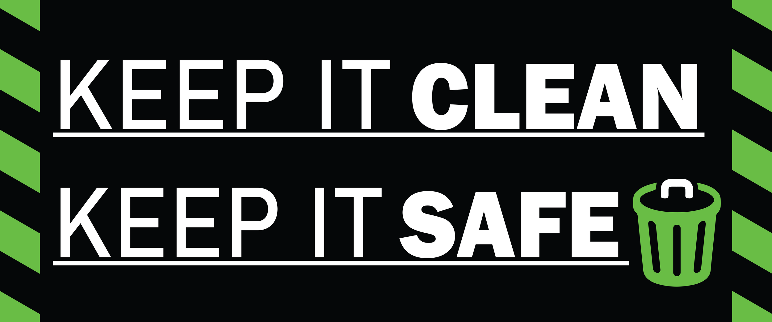
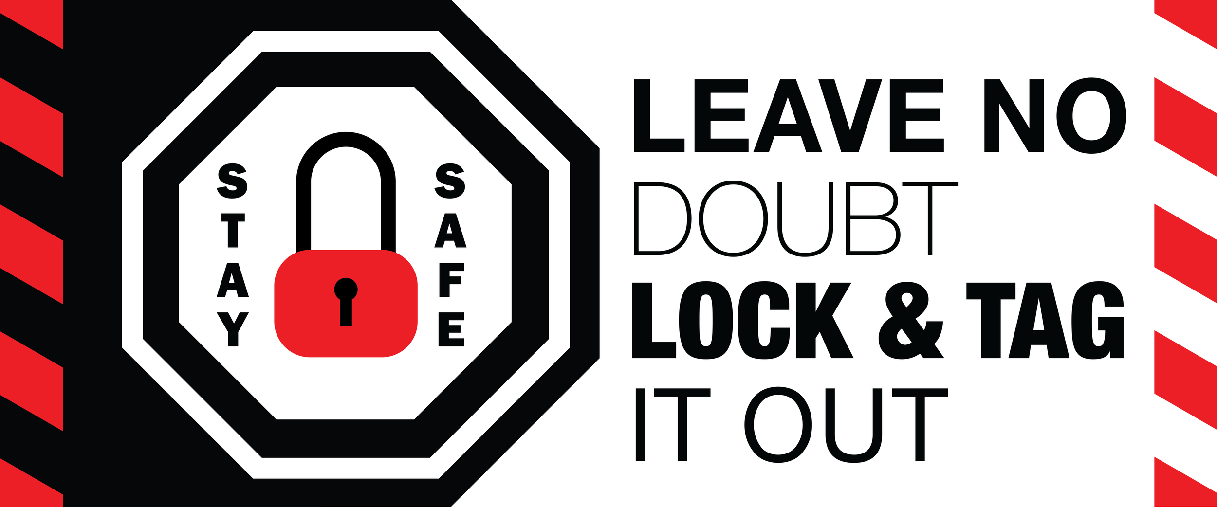
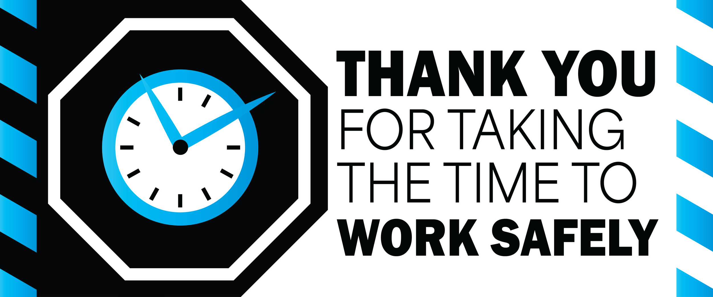
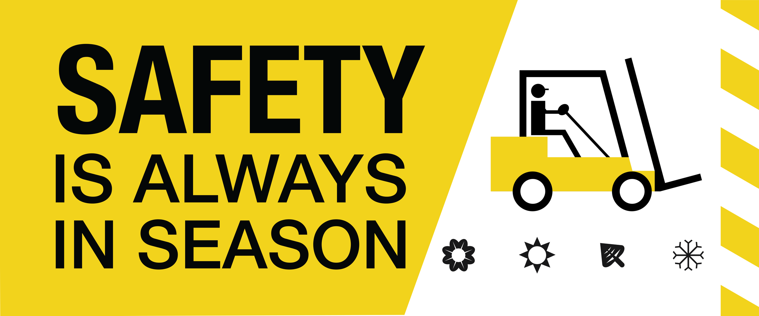
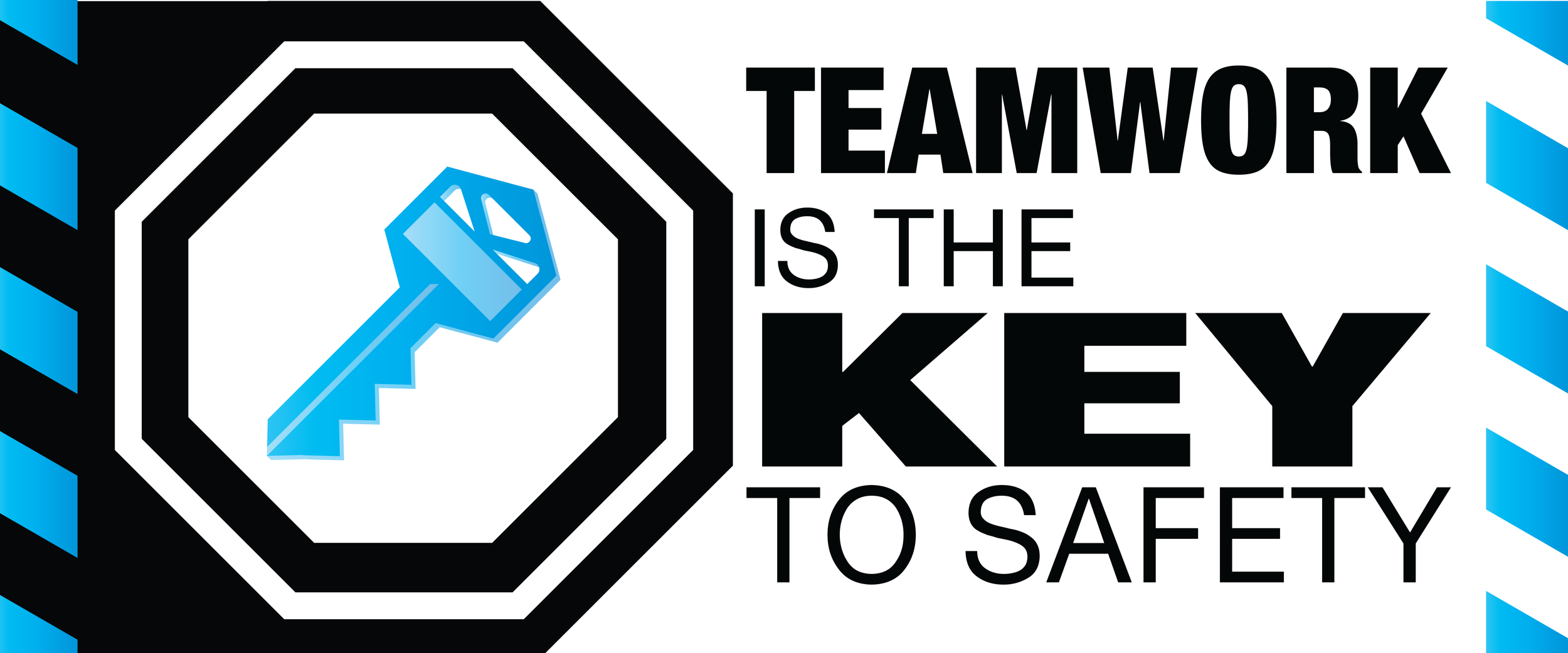
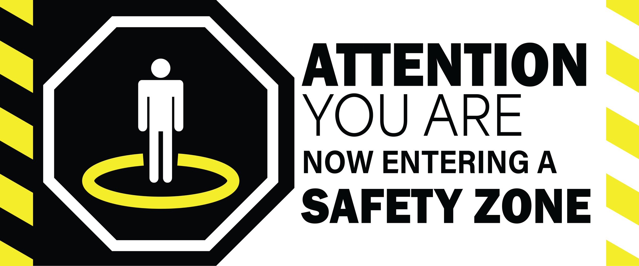
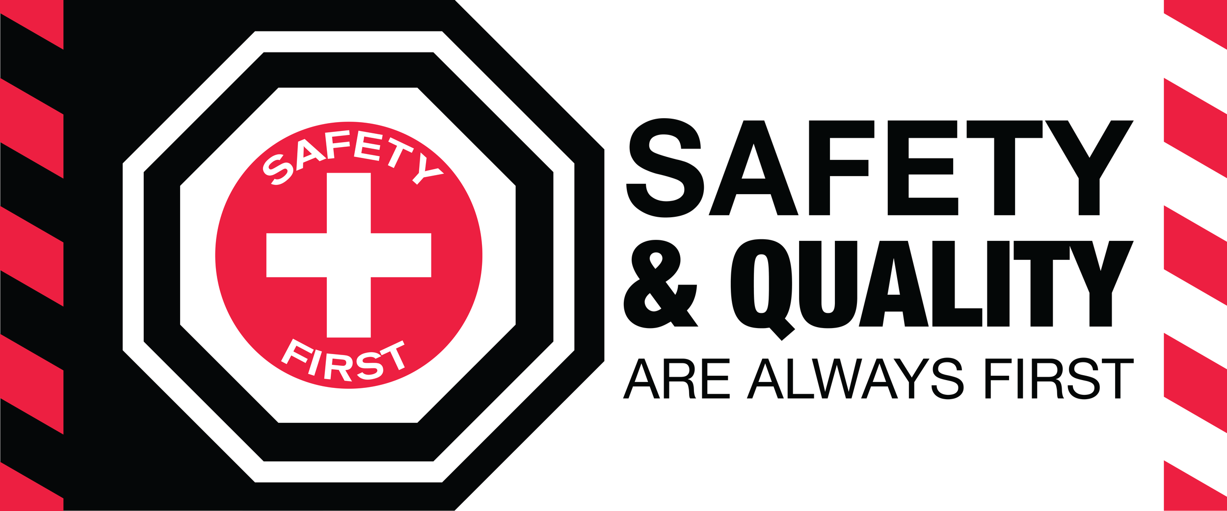
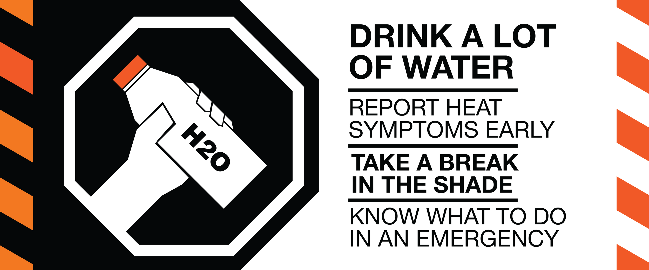
This was a very long and difficult project since we had to constantly get information from the client about what was working and what wasn’t. A lot of the initial designs we had were completely scrapped in favor of ideas that the client gave us. When we first came up with these concepts for the banners, we were only given the text that was going to be on each banner for a brief description. The rest we ended up coming up with ourselves, and once we submitted it to the client, they came back to us with more feedback on a proper idea and layout for the banners.
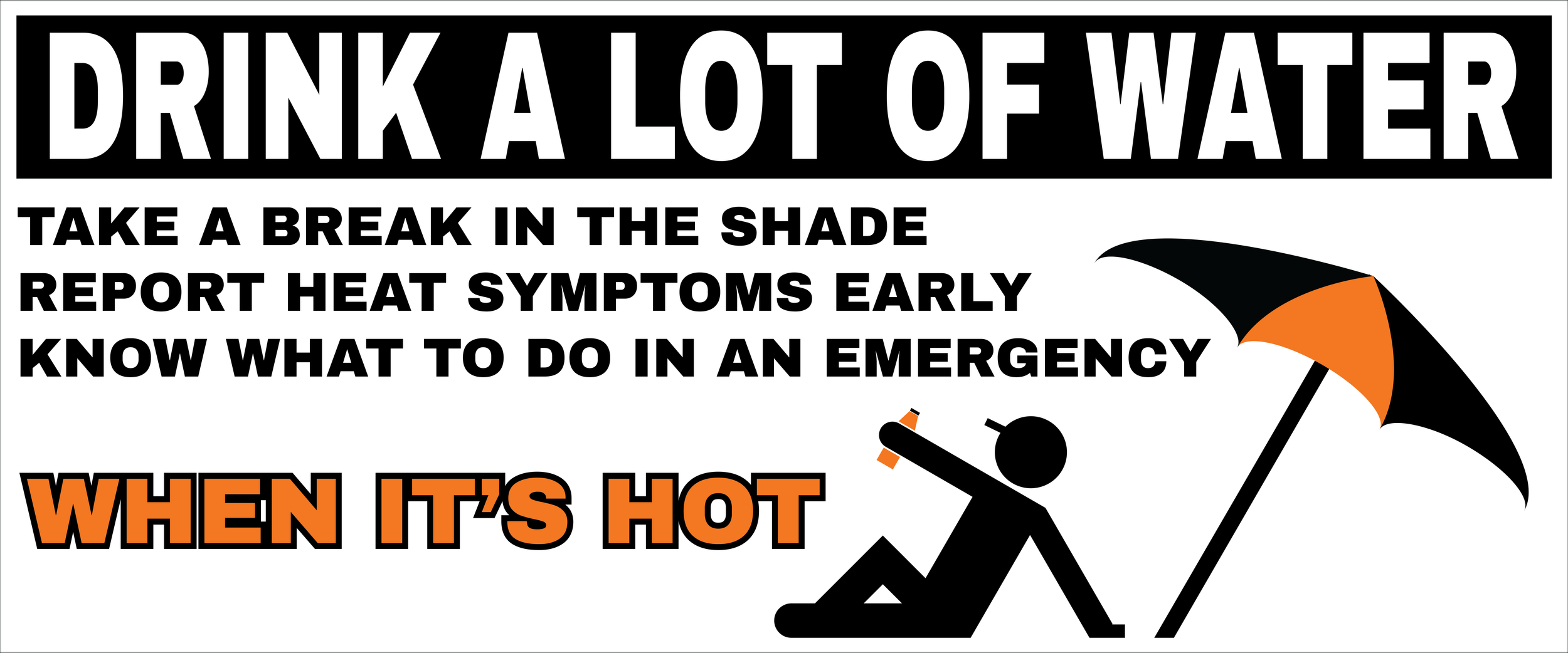
Original Concept
Final Concept
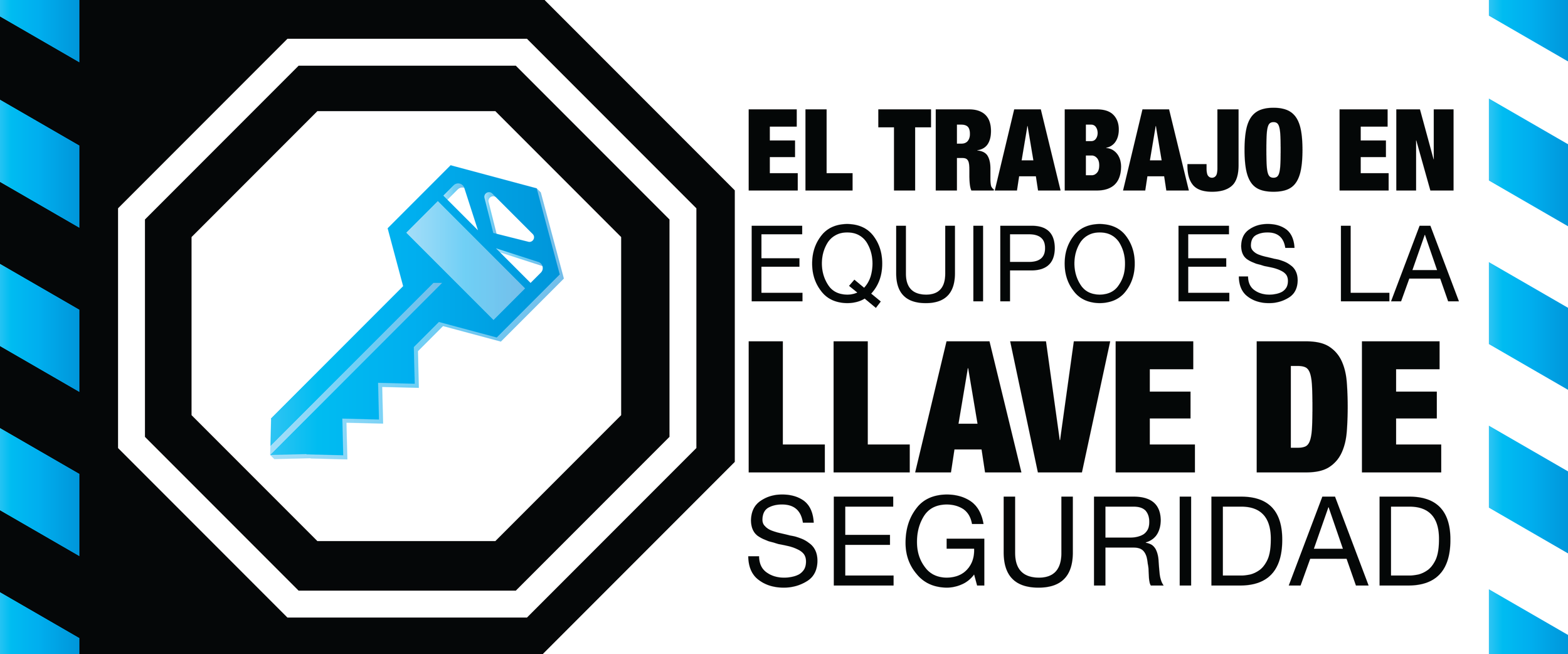
However, our work didn’t just finish with the final product. Crate & Barrel is a very large corporation with many people who work for it, as well as in other countries. Spanish is the 2nd most spoken language in the United States, and they asked us to make alternate versions of the banners written in Spanish.
English